Visualization
Encoding Information into Intuition
1. Goals of Visualization
-
To broaden your understanding of the data.
-
To communicate results/conclusions to others.
Altogether, these goals emphasize the fact that visualizations aren’t a matter of making “pretty” pictures.
2. An Overview of Distributions
-
The total frequency of all categories must sum to 100%
-
Total count should sum to the total number of datapoints if we’re using raw counts.
Most of the time, we're ploting the distribution of the data.
3. Variable Types Inform Plot Choice
Recall the types of the variable:

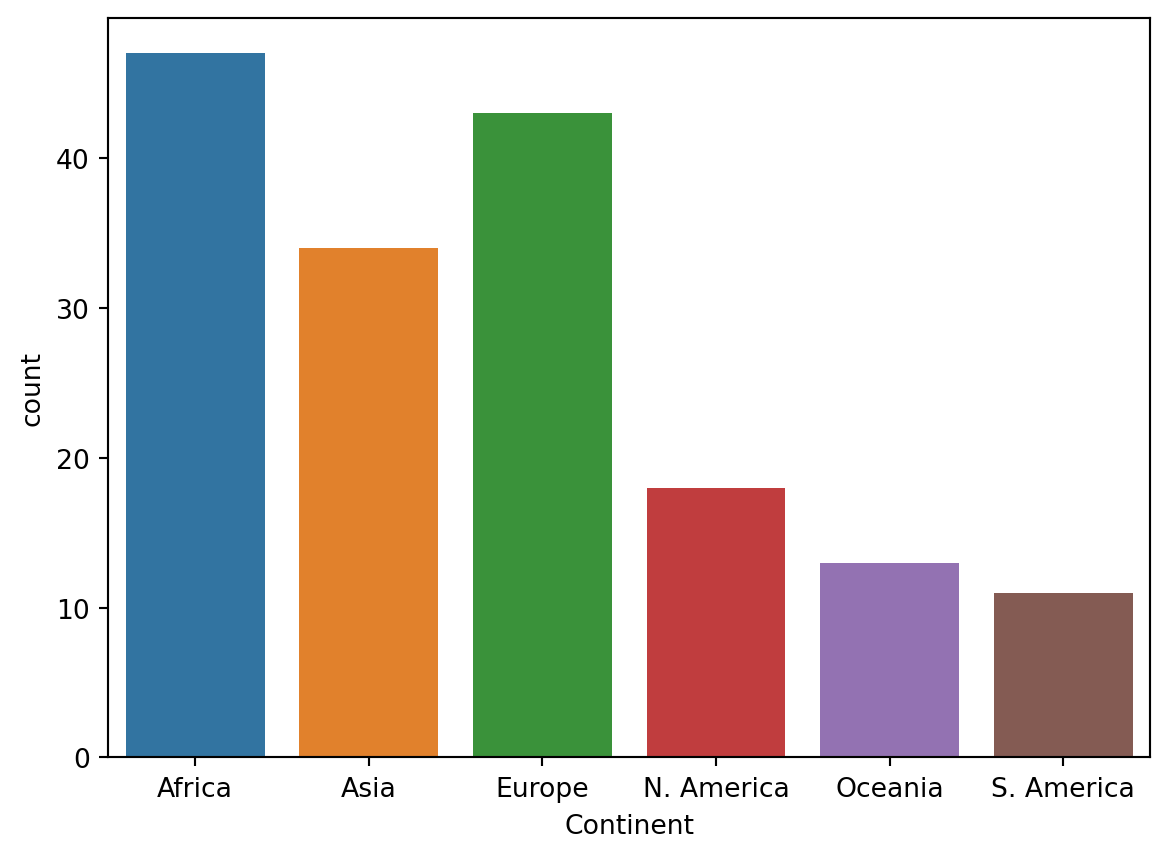
3.1 Qualitative Variables: Bar Plots
1 | import seaborn as sns # seaborn is typically given the alias sns |
3.2 Quantitative Variables: Box, Violin and Hist
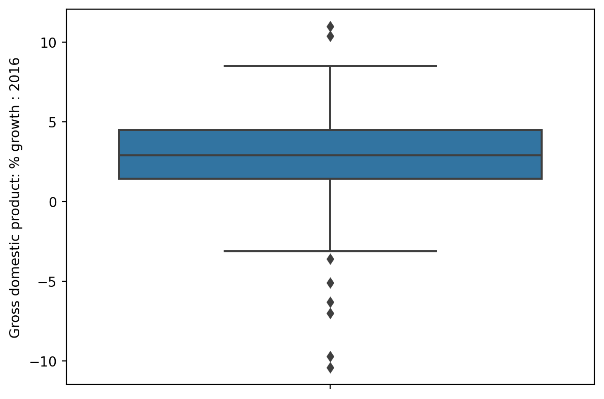
Box
1 | sns.boxplot(data=wb, y='Gross domestic product: % growth : 2016'); |
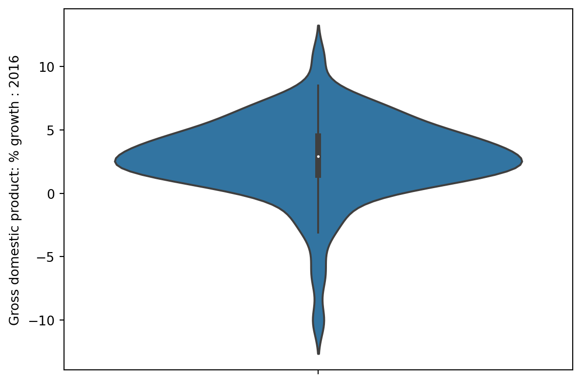
Violin
1 | sns.violinplot(data=wb, y='Gross domestic product: % growth : 2016'); |
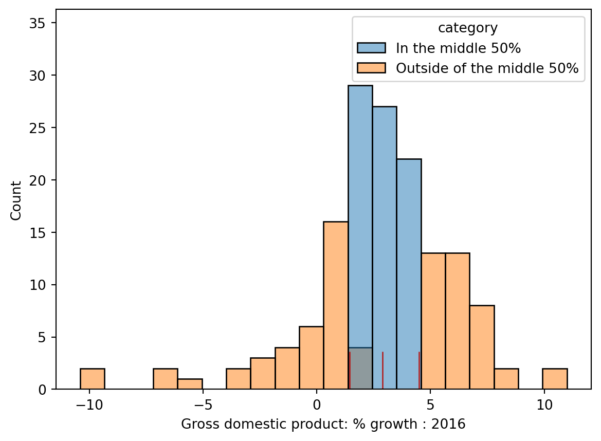
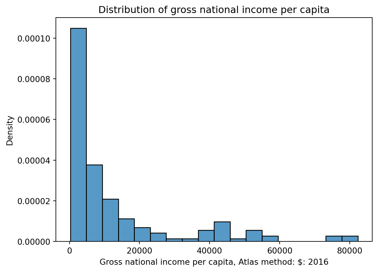
Histograms
1 | sns.histplot(data=wb, x="Gross n...", stat="density") |
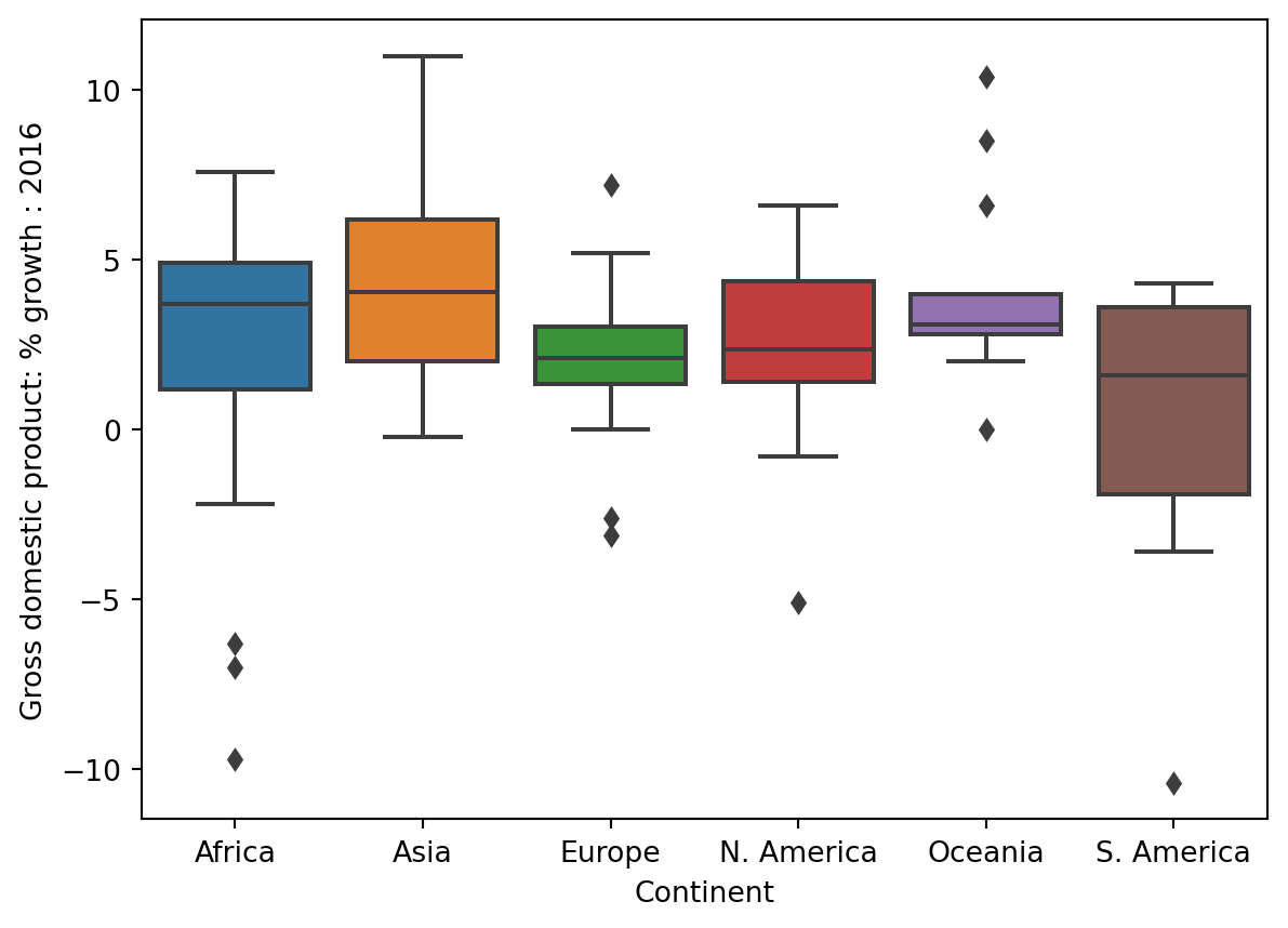
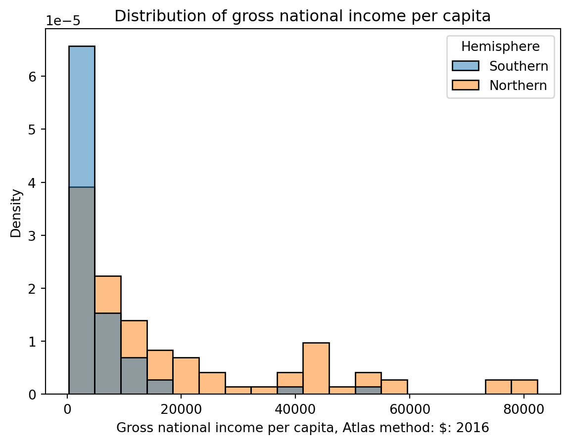
Overlap
1 | sns.boxplot(data=wb, x="Continent", y='Gross n...') |
4. Evaluating Histograms
-
Skewness and Tails
- Skewed left vs skewed right
- Left tail vs right tail
-
Outliers
- Using percentiles
-
Modes
- Most commonly occuring data
4.1 Skewness and Tails
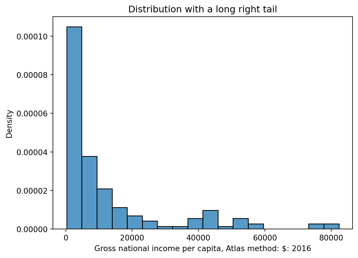
Left Skew and Right Tail
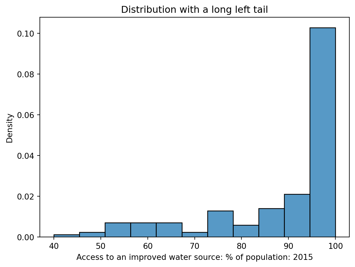
Right Skew and Left Tail
4.2 Outliers
Loosely speaking, an outlier is defined as a data point that lies an abnormally large distance away from other values.
4.3 Modes
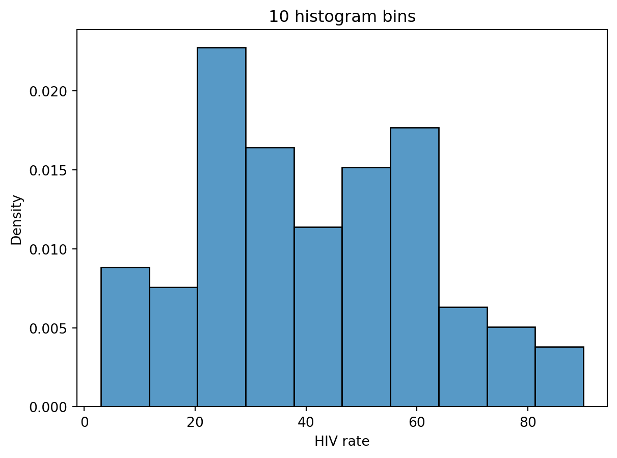
We describe a “mode” of a histogram as a peak in the distribution.
4.4 Challenge
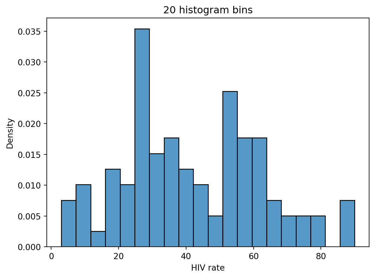
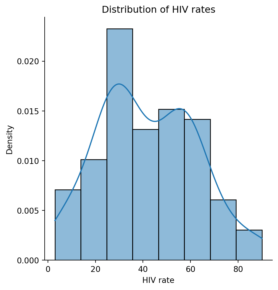
In this image, it's hard to observe. It is these ambiguities that motivate us to consider using Kernel Density Estimation (KDE)
5. KDE (Kernel Density Estimation)
-
A kernel density estimate (KDE) is a smooth, continuous function that approximates a curve.
-
More formally, a KDE attempts to approximate the underlying probability distribution from which our dataset was drawn.
5.1 Constructing KDE
-
Place a kernel at each datapoint.
-
Normalize the kernels to have a total area of 1 (across all kernels).
-
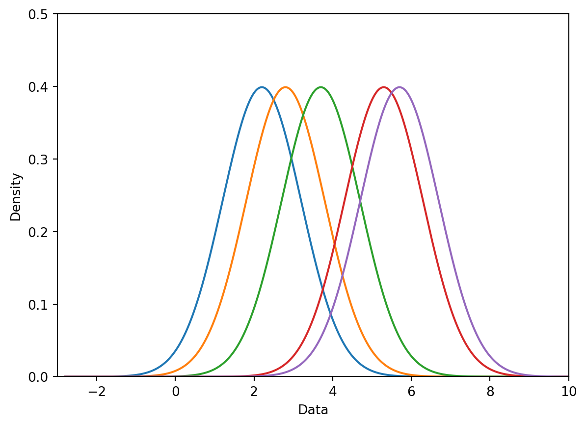
Sum the normalized kernels.
Assume we want KDE this dataset: [ 2.2, 2.8, 3.7, 5.3, 5.7 ]
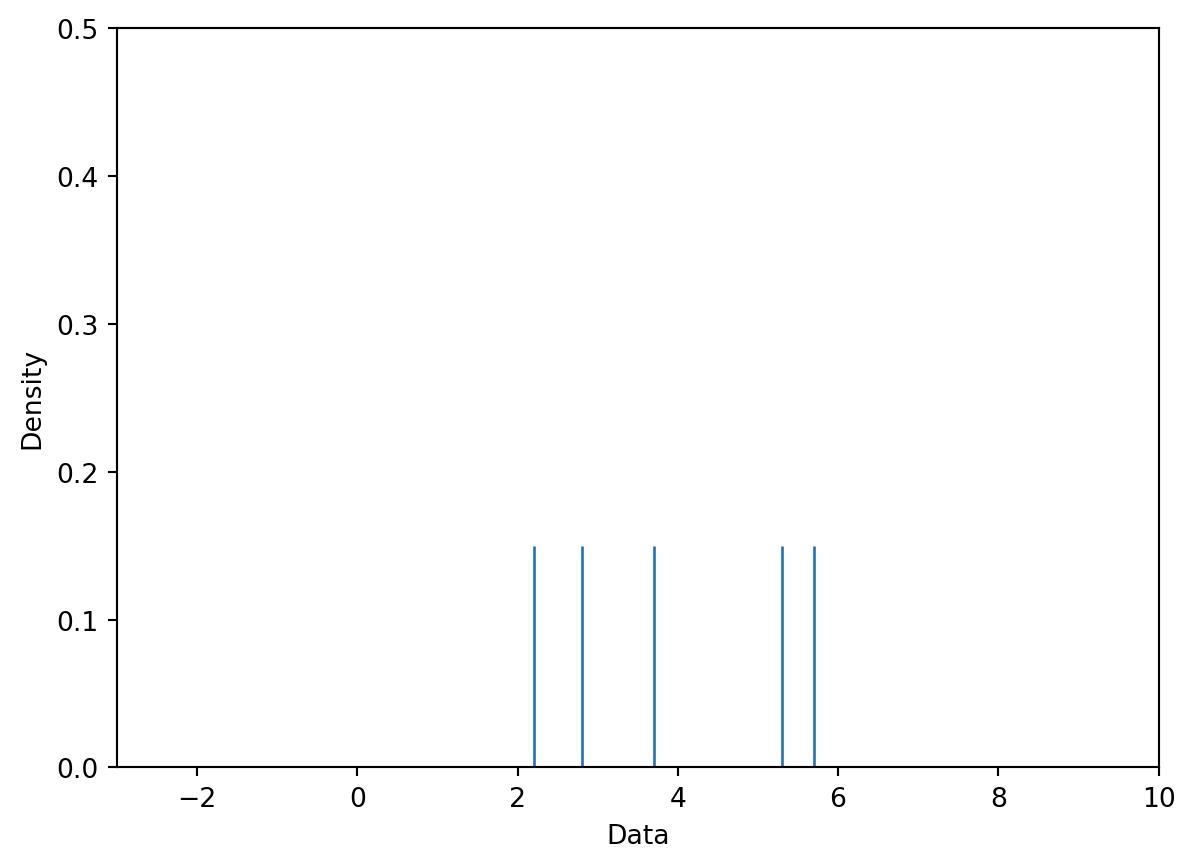
Step 1: Place a kernel at each datapoint.
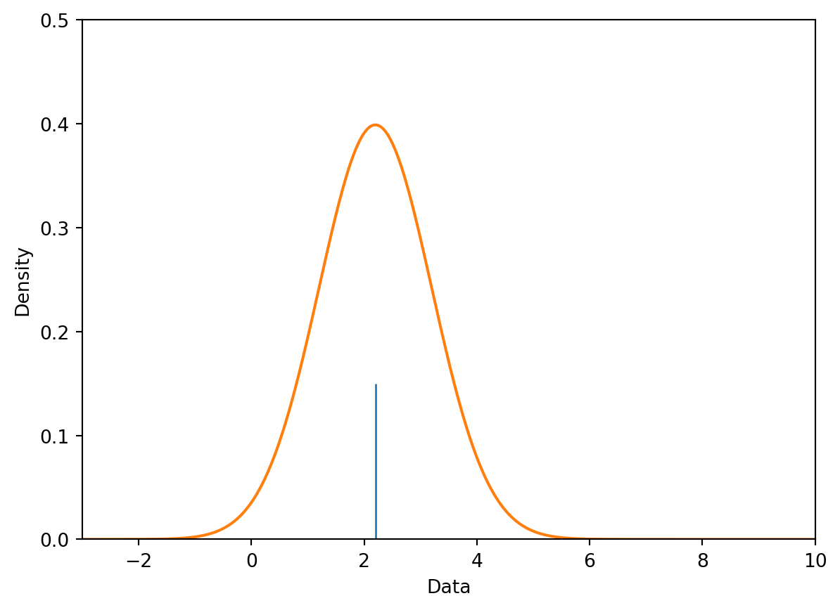
Step 2: Normalize the kernels to have a total area of 1.
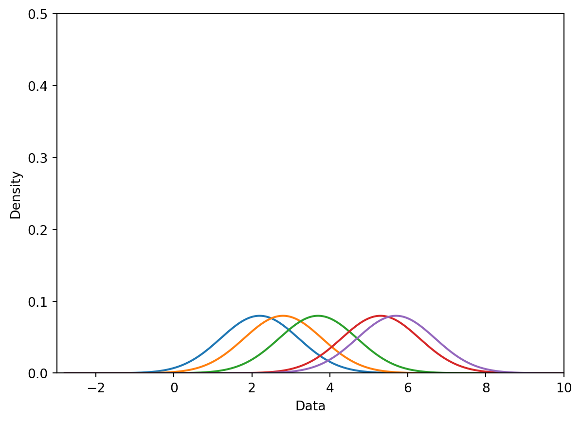
Step 3: Sum the normalized kernels.
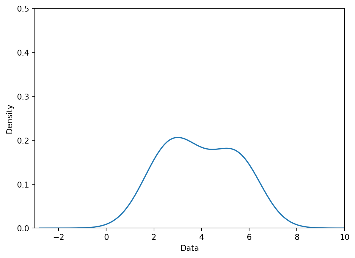
5.2 Kernel Functions and Bandwidths
A general “KDE formula” function is given bello
, which is pretty much like the convolution.
-
is the kernel centered on the observation
i. -
is the number of observed datapoints that we have.
-
Each represents an observed datapoint.
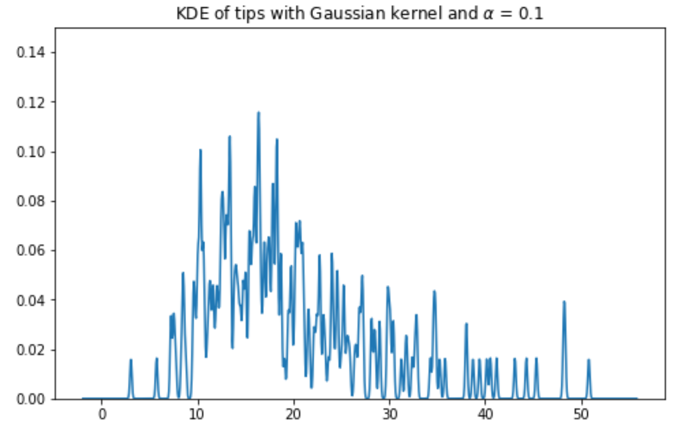
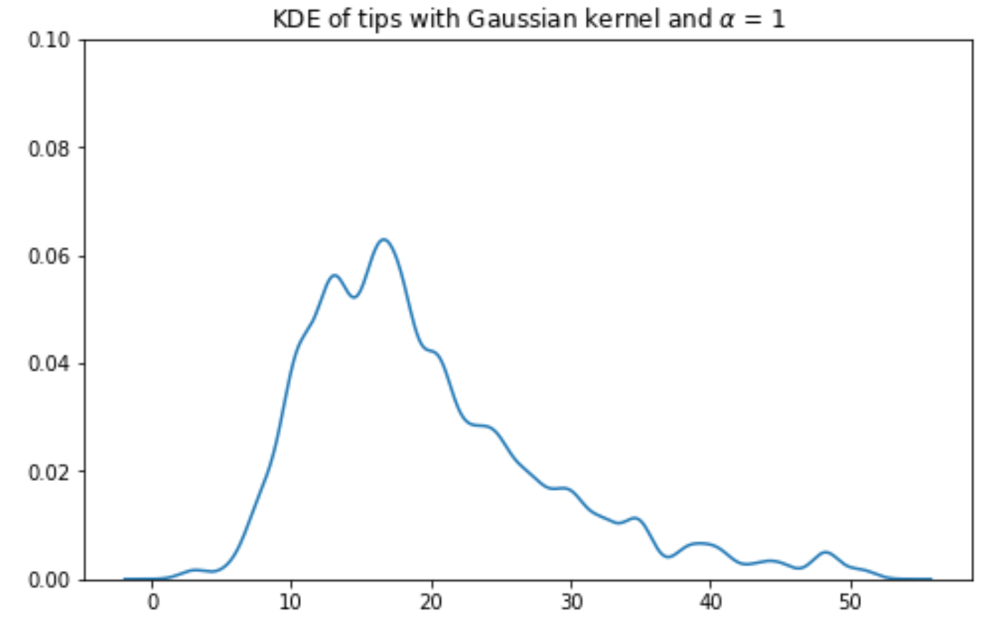
The most common kernel is the Gaussian kernel.
-
is the bandwidth of the kernel, which is the standard deviation.
-
is the center of the kernel, which is the mean.
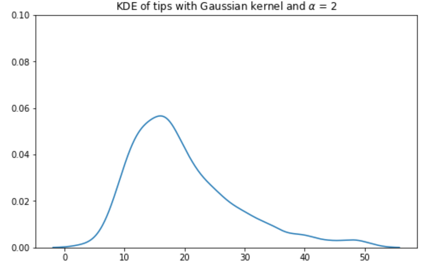
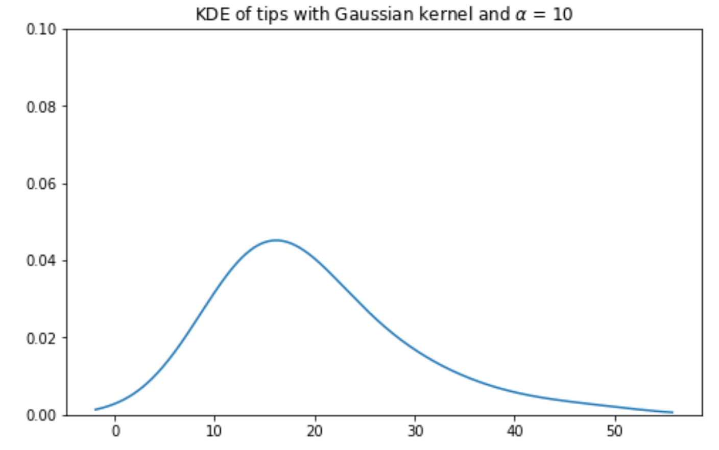
Gaussian kernel KDE with bandwiths: ; ; ; :
6. Multi Quantitative Variables
-
Up until now, we’ve discussed how to visualize single-variable distributions.
-
Going beyond this, we want to understand the relationship between pairs of numerical variables.
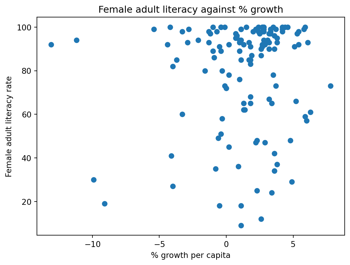
6.1 Scatter Plots
1 | plt.scatter(wb["per c..."], wb['Adult l...']) |
6.1 Scatter Plots
But this seems overplotting...

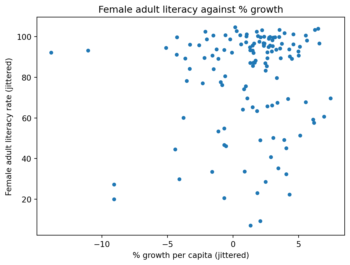
6.1 Scatter Plots
We can shrink the marks and add random shifting noise.
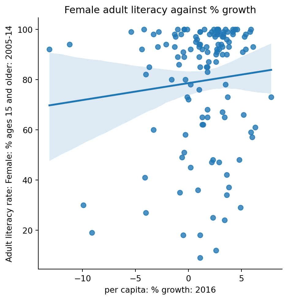
6.2 Linear Plots
1 | sns.lmplot(data = wb, x = "per c...", y = "Adult l...") |
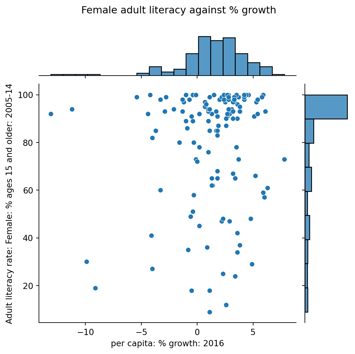
6.3 Joint Plots
1 | sns.jointplot(data = wb, x = "per c...", y = "Adult l...") |
6.4 Hex Plots
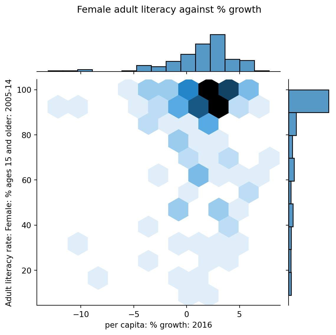
1 | sns.jointplot(data = wb, x = "per c...", y = "Adult l...", kind = "hex") |

6.4 Hex Plots
Hex plots can be thought of as two-dimensional histograms !

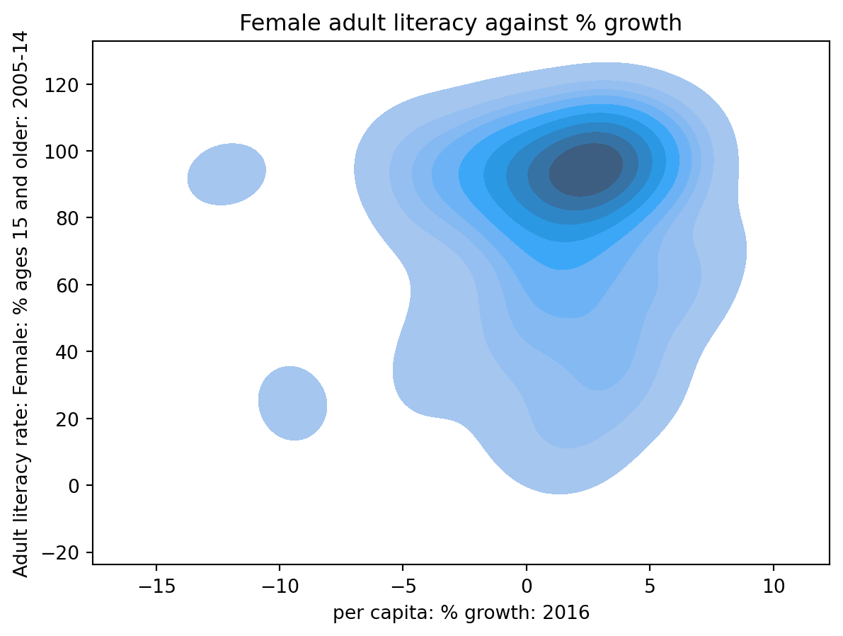
6.5 Contour Plots
Contour plots can be thought of as two-dimensional KDE !
1 | sns.kdeplot(data = wb, x = "per c...", y = "Adult l...", fill = True) |
7. Transformation
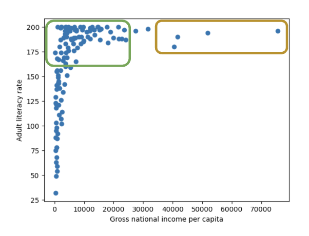
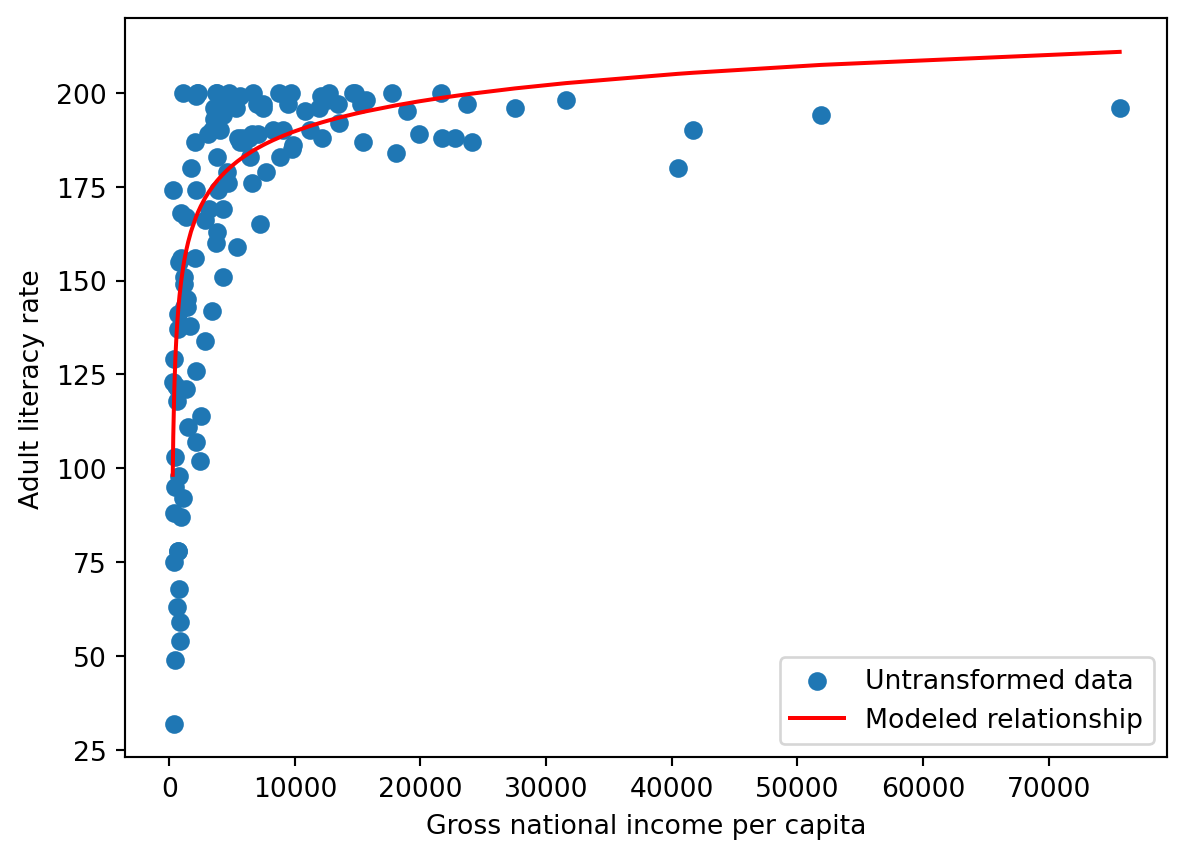
As said before, we want to reveal the relationships.
However, relying on plotting directly alone is limiting, not all plots show association.
Consider the following plot.
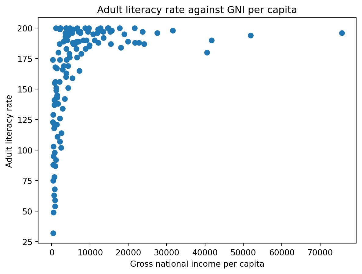
We can try applying transformation !

7.1 Making Transformation
Step 1: Observe the plot
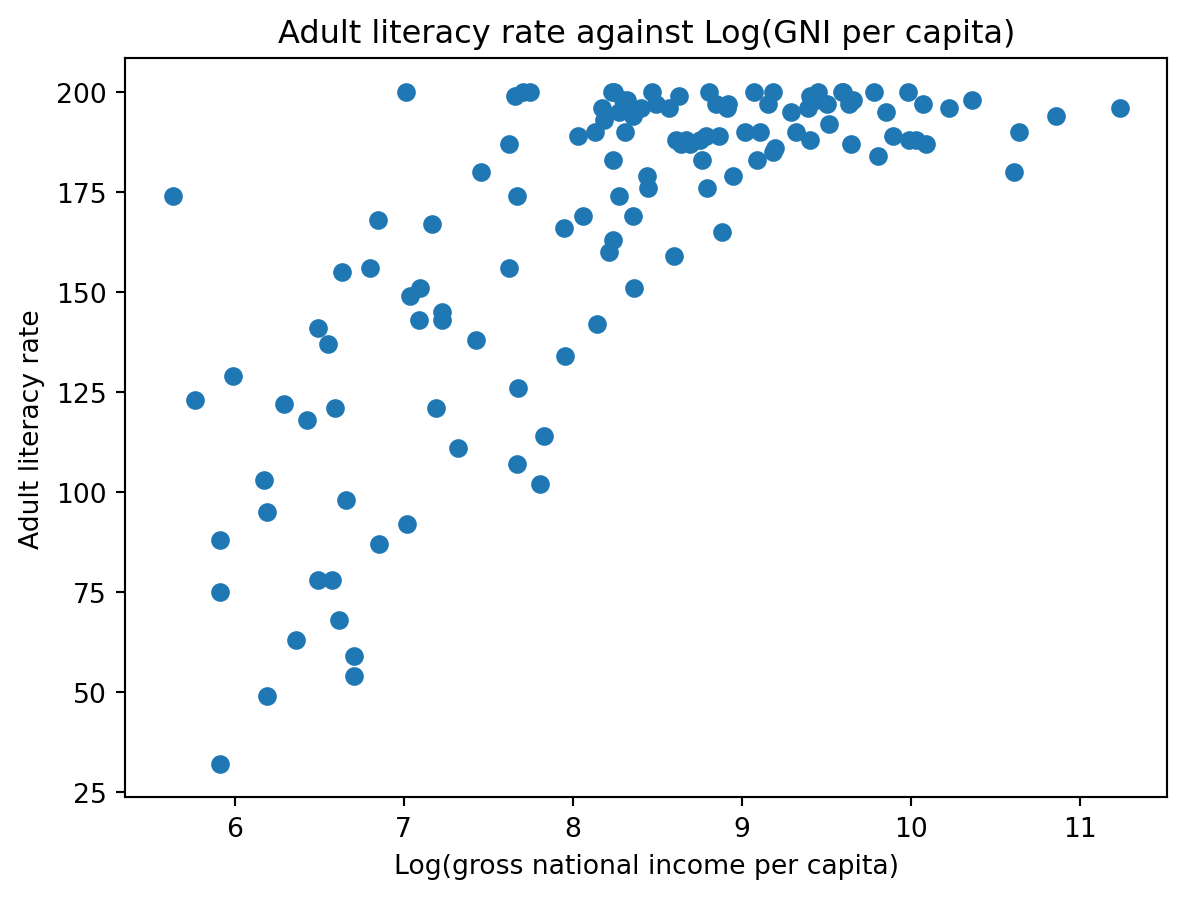
Step 2: Transform on X axis
1 | plt.scatter(np.log(df["inc"]), df["lit"]) |
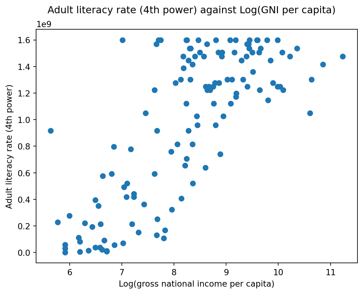
Step 3: Transform on Y axis
1 | plt.scatter(np.log(df["inc"]), df["lit"]**4) |
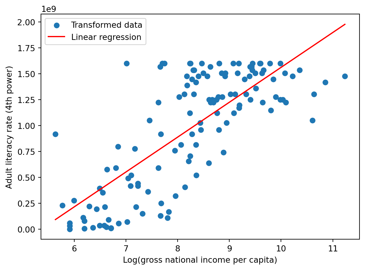
Step 4: Linear regression
1 | from sklearn.linear_model import LinearRegression # Discuss in the future |
7.2 Inference reversely

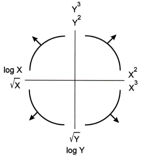
7.3 Tukey-Mosteller Bulge Diagram
This diagram is a good guide when determining possible transformations.
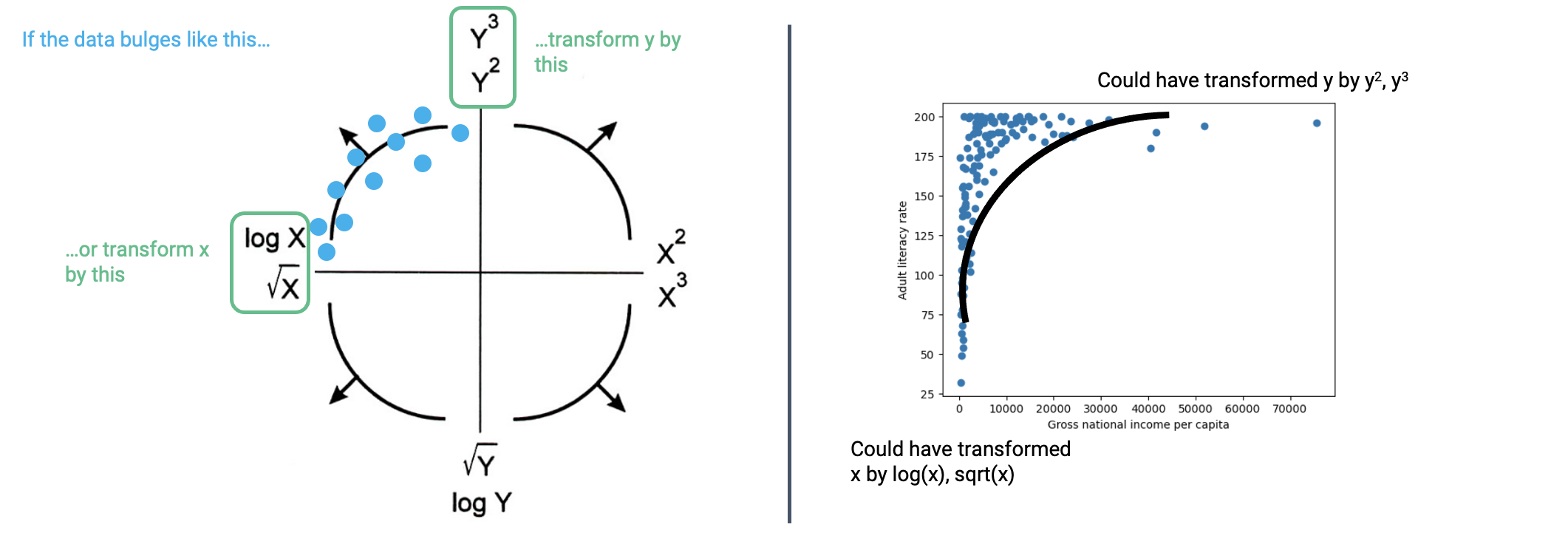
8. Visualization Theory
Remember, we had two goals for visualizing data. Visualization Theory is particularly important in:
- Helping us understand the data and results,
- Communicating our results and conclusions with others.
8.1 Information Channels
Visualizations are able to convey information through various encodings.
Except things in the image, marks' relative position is also a important channel.
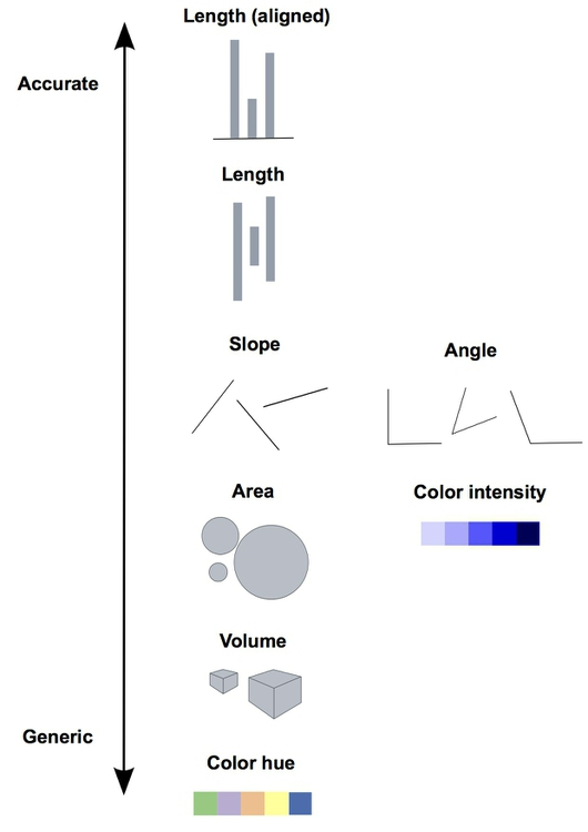
Each visulization should at least contains one accurate channel.
Thus don't use pie chart any more!
8.2 What is Good Encoding?
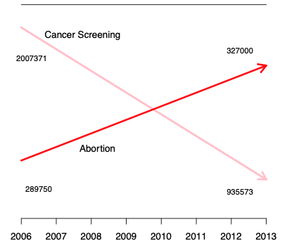
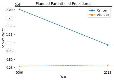
- No wrong information encoded
- Example: Are abortion and cancer related?
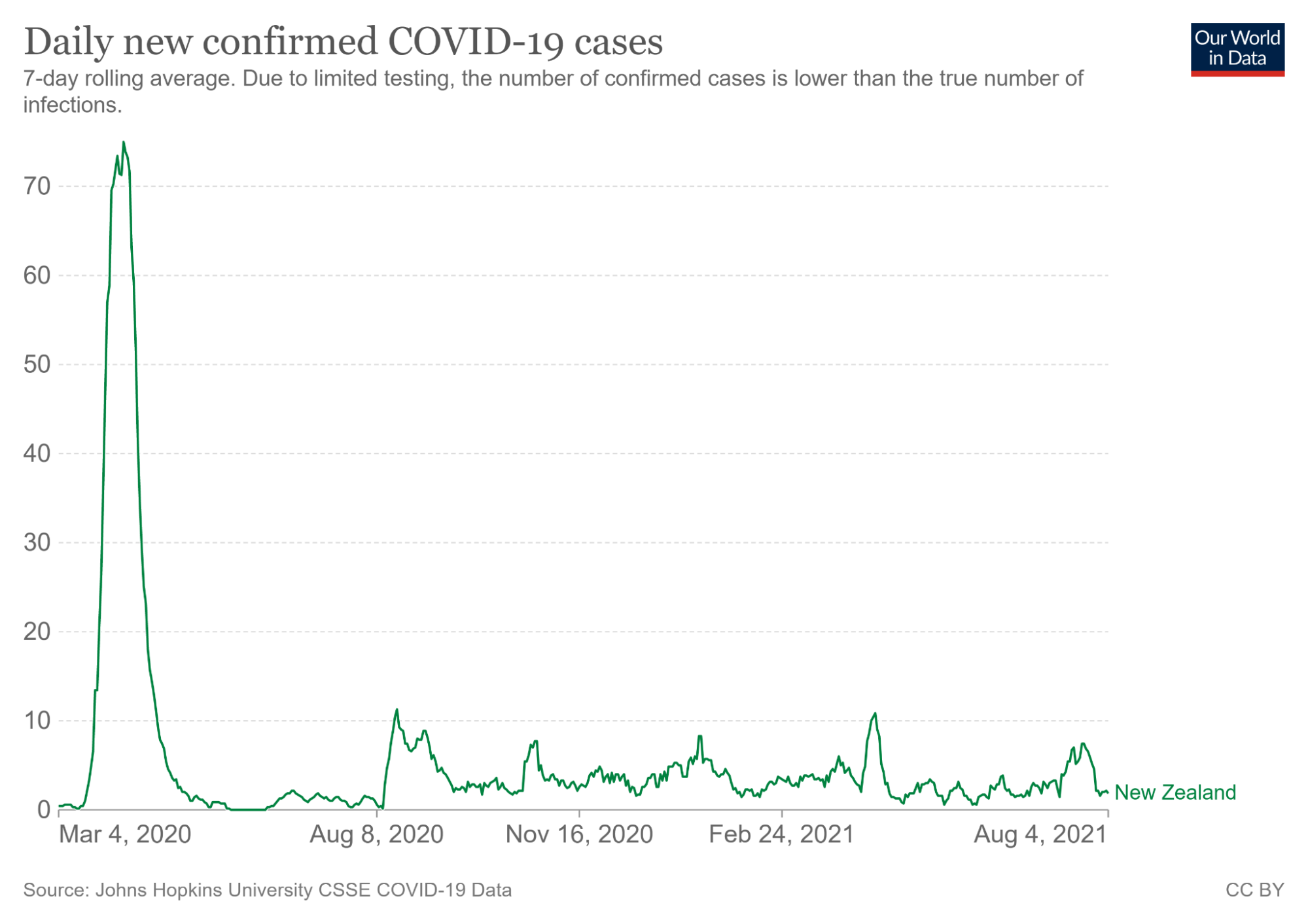
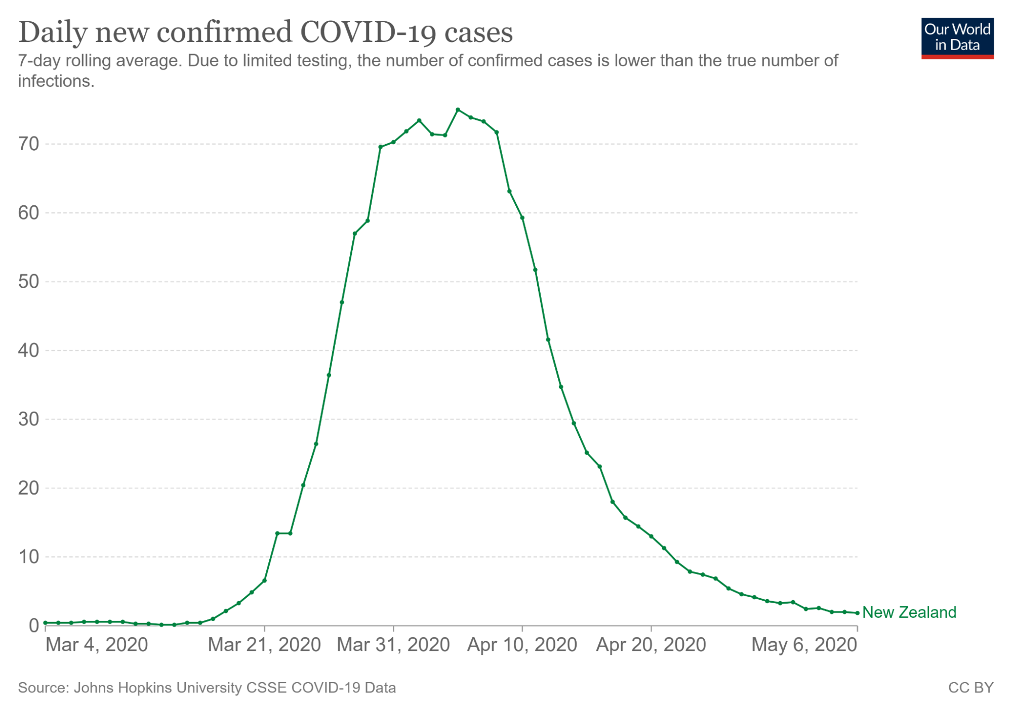
- No redundent infomation encoded
- Example: How cases changed during Mar, 21,2020 to May, 6, 2020?
- Encode information linearly
- Example: Shows the numerical strength distribution in 2D.
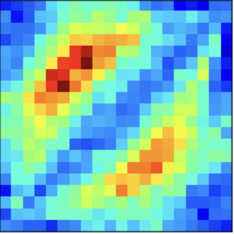
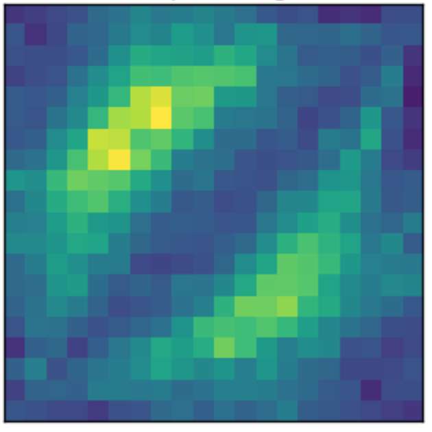
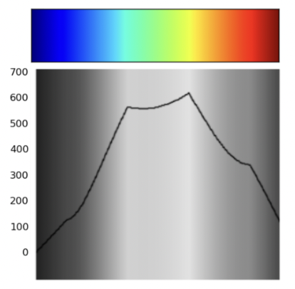
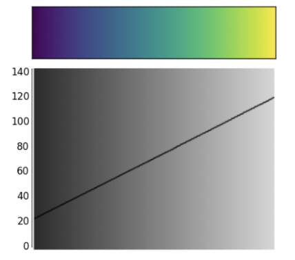
- Encode information linearly
- Larger number show be mapped to higher gray scale color.
9. Summary
Good visualizations are always made by Intuitive and Empathetic Person